Airbnb is one of the world’s most popular platforms for travelers seeking fast, affordable, and convenient accommodation. As user expectations evolve, platforms like Airbnb must adapt to meet the demand for more personalized, seamless, and intuitive digital experiences. This project explores a refreshed UI concept that enhances usability while preserving the core functionality millions rely on.
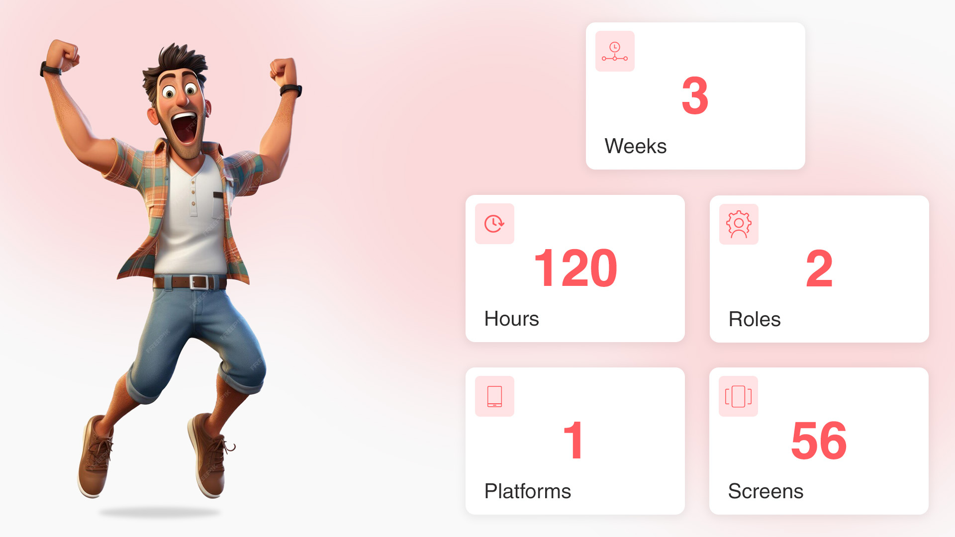
I took a deep dive into the core of the service, aiming to understand where users encountered friction. Identifying these key pain points required thorough research and analysis. With input from the team, I mapped out a basic user journey to visualize the essential user flows and highlight areas for improvement. From there, I developed initial wireframes, continuously refining them through feedback and iteration. Once we were confident in the structure, we progressed to the next phase of the design process.
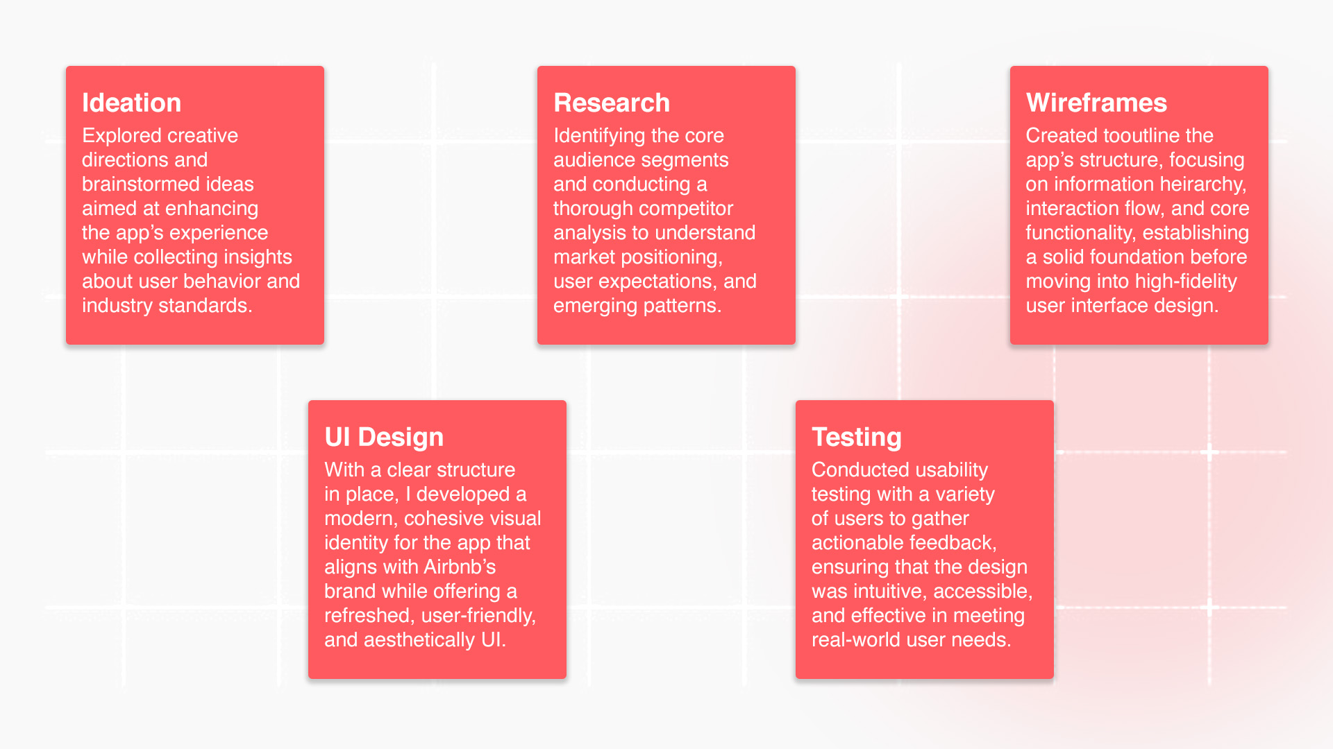
Milestones
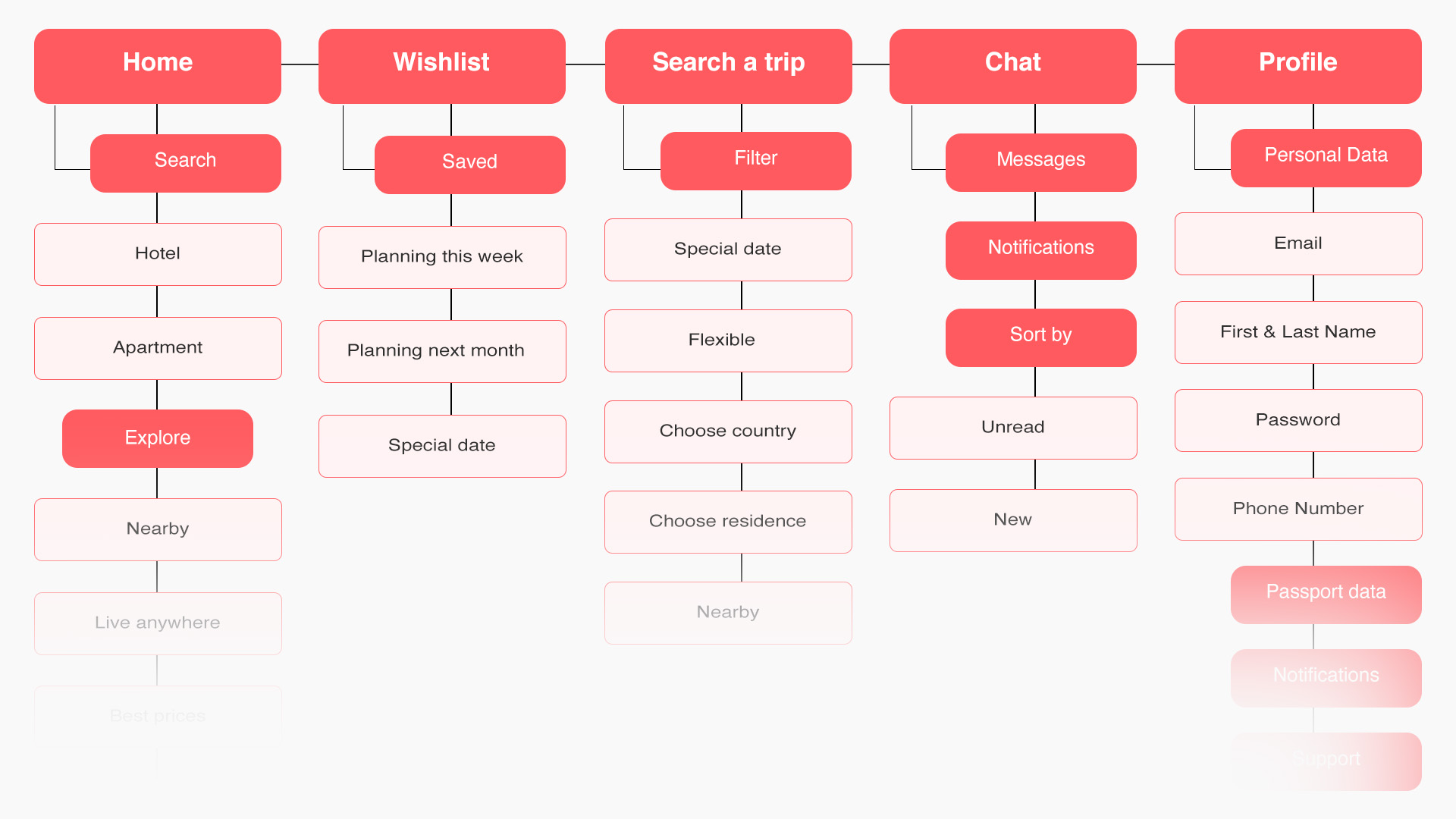
Information Architecture
Lo-Fi Wireframes
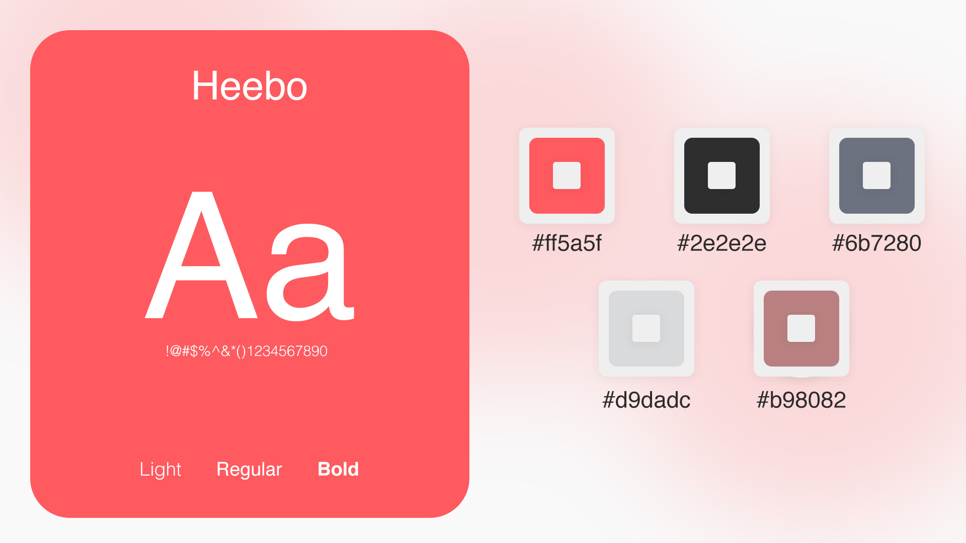
Branding
Moodboards
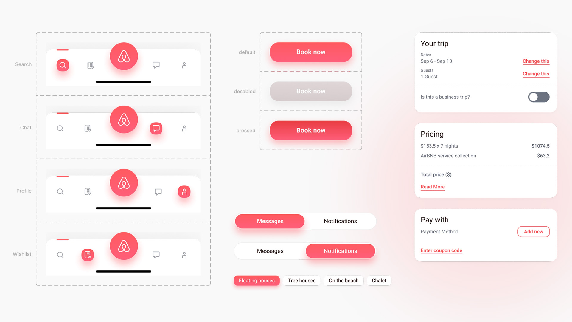
Design Systems
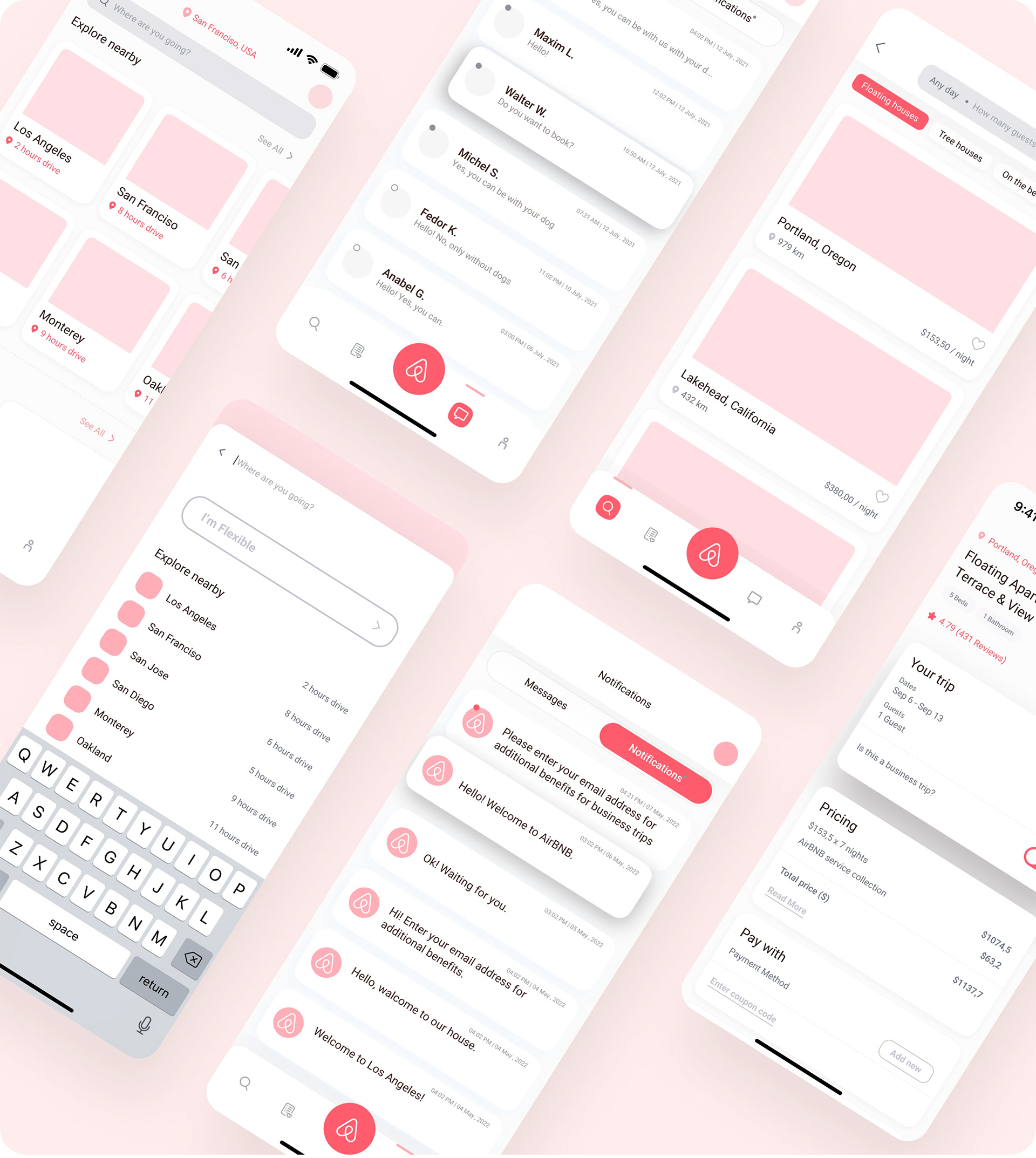
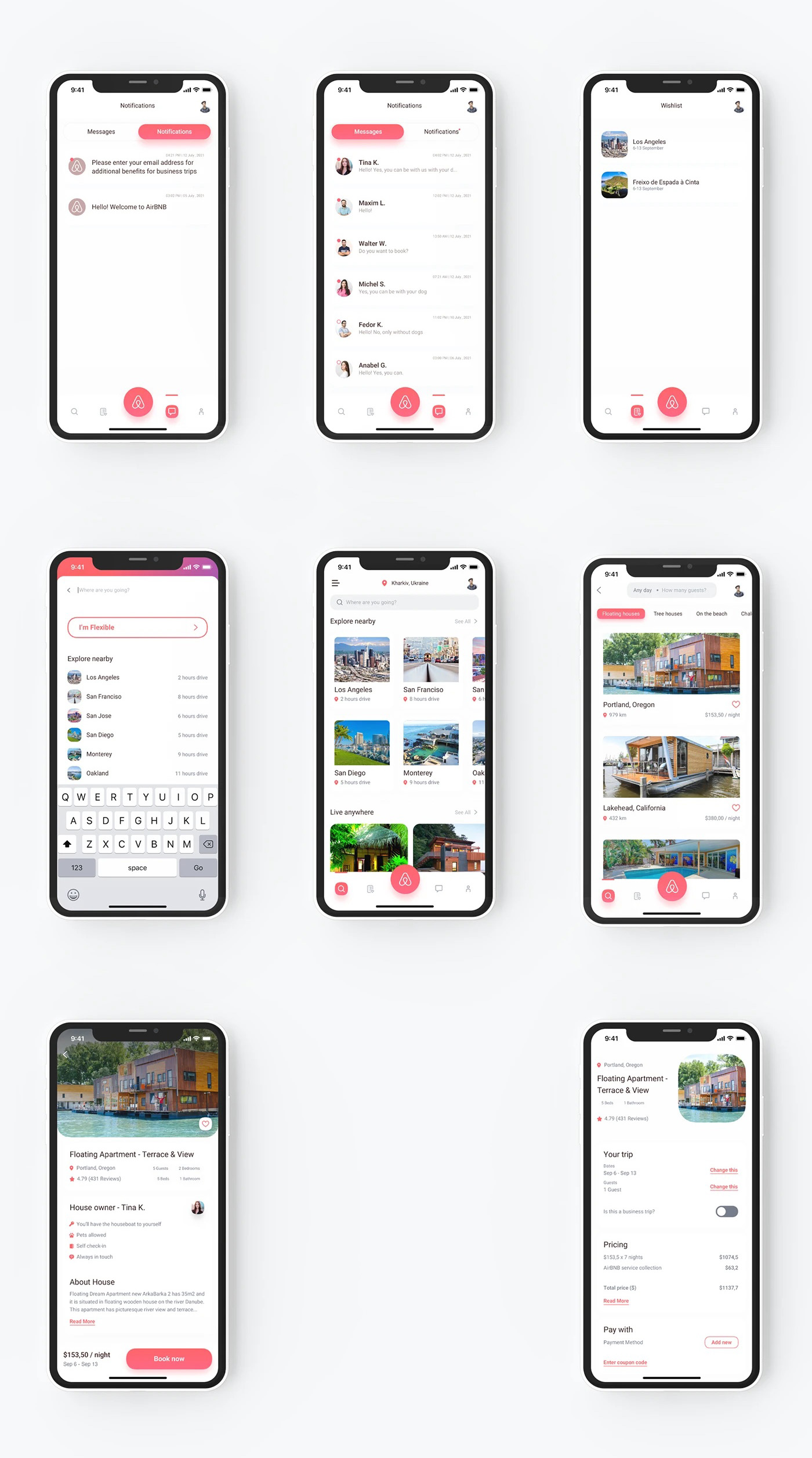
Hi-Fi Prototypes
Insights & Recommendations
Users expect tailored experiences—designs that adapt to their preferences can significantly boost satisfaction and retention.
Simplifying user flows and reducing cognitive load improves task success rates and overall engagement.
A unified visual language across the app builds trust, enhances usability, and strengthens brand identity.
Regular feedback from real users ensures the design remains intuitive, relevant, and aligned with evolving needs.
WeLearn is an innovative e-learning platform aimed at transforming the way learners engage with educational content. The client envisioned an intuitive mobile experience that makes learning accessible, engaging, and interactive for students of all levels.
The project involved defining user needs and objectives through ideation to testing, ensuring an intuitive user experience. Wireframes define the app flow structure before refining the visuals. Testing was conducted to gather feedback and optimize usability for a seamless learning experience.
Milestones
Information Architecture
Lo-Fi Wireframes
Branding
Moodboard
Design Components
Hi-Fi Prototype
Insights & Recommendations
User-centered design is Crucial – Prioritizing usability, accessibility, and intuitive navigation improves engagement and retention.
Structured Information Architecture Enhances Learning – Categorizing lessons, courses, and assignments prevents content overload and improves discoverability.
Gamification & Progress Tracking Boost Motivation – Features like progress bars, certificates, and interactive quizzes increase user participation and completion rates.
Mobile Responsiveness is Non-Negotiable – Ensuring seamless performance across various devices enhances reach and accessibility for learners on the go.
Nike is a global leader in sportswear and innovation, known for pushing the boundaries of athletic performance and style. The client aimed to enhance its mobile shopping experience, making it faster, more engaging, and user-friendly. The goal was to create a seamless e-commerce journey, from product discovery to checkout, ensuring high conversion rates and customer retention. With a focus on personalization, exclusive deals, and effortless navigation, the app needed to align with Nike’s dynamic brand identity.
ClientNike
ServiceE-Commerce
TeamUser Researcher, Data Analyst, UI & UX Designer
Nike needed a bold, high-performance mobile shopping experience that enhanced product discovery, streamlined checkout, and boosted conversions. With a fast-paced workflow, they sought a design partner who could work independently, iterate quickly, and deliver a seamless user experience.
Milestones
Information Architecture
Lo-Fi Wireframes
Branding
Moodboard
Design System
Hi-Fi Prototype
Insights & Recommendations
Personalization Increases Engagement:Implementing AI-driven recommendations and tracking user behavior enhances product discovery and boosts conversion rates. Tailored content keeps users engaged and encourages repeat purchases.
Streamlined Checkout Reduces Abandonment: A one-click checkout, multiple payment options, and auto-filled user details significantly improve cart-to-purchase conversion rates. Reducing friction at checkout leads to higher sales.
Limited-Time Offers Drive Urgency: Time-sensitive promotions, flash sales, and exclusive deals create FOMO (Fear of Missing Out), increasing click-through rates (CTR) and purchase intent.
Mobile-first design is key to ensuring a responsive, fast-loading UI with gesture-friendly navigation that improves the mobile shoppingexperience, leading to better user retention and satisfaction.
This SaaS solution is seamlessly integrated with your existing tools and workflows. No more problems trying to get different software to operate together.
Hero Section: Highlights the core message, “Changing Life by Changing the Software,” setting the tone for innovation and efficiency. Feedback Tracker: A streamlined system for gathering, managing, and analyzing user feedback. Generate Weekly & Monthly Reports: Automated report generation for better insights and data-driven decision-making. Secure Collaboration: Provides a safe and seamless way for teams to work together efficiently.
This is designed to drive engagement and conversions, ensuring visitors clearly understand the value Lason brings. The balance between functionality, user trust elements, and a visually appealing interface makes it an ideal SaaS solution for businesses.
A mobile app experience for NEAT Hotels, focusing on an intuitive and seamless hotel booking journey. This project includes both low-fidelity and high-fidelity wireframes, ensuring a structured design process that prioritizes usability, accessibility, and a smooth user experience.
Log In & Sign Up: Secure and user-friendly authentication for easy access. Room Types & Selection: Allows users to browse different room categories with detailed descriptions and images. Room View & Details: Provides a closer look at amenities, pricing, and availability. Booking Confirmation: A clear summary of the selected room and stay details. Barcode Payment Mode: A streamlined and secure payment process with barcode integration.
Low Fidelity
High Fidelity
This design ensures a smooth and engaging hotel booking experience, making it easy for users to browse, book, and confirm their stay with confidence. By incorporating aesthetic appeal, user-friendly navigation, and secure transactions, the app enhances the overall hospitality experience for travelers.
The hero section embodies trust and innovation, setting the stage for users to trade with confidence. With a bold yet clean layout, engaging typography, and a futuristic color scheme, the design ensures an impactful first impression.
An intuitive landing page design for Uxpeak, an online learning platform dedicated to UX/UI designers. This page delivers a seamless user experience with a clean layout, bold typography, and engaging visuals to inspire both beginners and professionals to elevate their design skills.
Hero Section: Creates an instant connection with aspiring designers with a tagline “Take Your UX/UI Design Skills to the Next Level,”. Destination for UX/UI Designers: Highlights the value Uxpeak provides, showcasing its courses and learning paths. Expert Sections: Introduces industry professionals leading the courses, reinforcing credibility. Join Us: A clear, high-converting call-to-action encouraging sign-ups. Testimonies: Features success stories and positive experiences from learners. Growing Community: Showcases the vibrant network of UX/UI designers learning together. Latest Blog: Offers insights, trends, and expert tips in the UX/UI field. Footer: Provides essential links, support information, and social media connections.
This landing page is designed with a sleek, engaging, and conversion-focused approach, ensuring users can easily explore courses and take action. The balance between trust-building elements, compelling CTAs, and an intuitive layout makes it the perfect platform for aspiring and professional designers to grow.
This is a modern and visually appealing Grocery Store Landing Page focusing on a seamless shopping experience for fresh and organic products. The design is clean, user-friendly, and optimized for conversions, ensuring a smooth journey from browsing to checkout.
The Grocery Store landing page was designed for high engagement, seamless navigation, and better conversions. It ensures a smooth shopping experience, clear product discovery, and optimized device performance.
Milestones
Information Architecture
Lo-Fi Wireframes
Branding
Moodboard
Design Components
Hi-Fi Prototype
Insights & Recommendations
CTA Placement Matters – Strategically placed Buy Now & Snag the Deal buttons significantly boost conversions.
Trust Elements Drive Sales – Testimonials & clear shipping policies reduce hesitation and increase credibility.
Mobile-First is Key – The mobile experience must be seamless, ensuring easy browsing and checkout.
SEO & Content Marketing – Regular blogs and product updates enhance Google rankings and organic traffic.
This is a methodology for creating design systems by breaking down user interfaces into five hierarchical levels: Atoms – Basic building blocks (buttons, inputs, labels). Molecules – Groups of atoms forming functional components (a search bar).Organisms – Complex components made of molecules and atoms (a navigation bar). Templates – Page structures defining layout and content arrangement. Pages – Final representations of the UI with real content.
It helps create scalable, consistent, and reusable design systems.
What is a Design System? A design system is a comprehensive collection of reusable components, guidelines, and standards that ensure consistency in digital products. It includes UI elements, typography, colors, design principles, and code snippets, helping teams streamline collaboration, maintain brand identity, and scale designs efficiently.
Why is a Design System important? It ensures consistency, boosts efficiency, and supports scalability, on digital products. It provides reusable components and guidelines, stream-lining collaboration, between designers, and developers. This leads to a cohesive user experience, maintains brand identity, and frees up time for innovation.
Key Takeaways
Collaboration and consistency are essential—they keep designs polished and save valuable time.
Iterate instead of striving for perfection—starting small and refining helps maintain flexibility and creativity.
Documentation is a game-changer—it ensures alignment and clarity across teams.
A design system isn’t just about aesthetics—it’s about practicality, problem-solving, and a touch of humor in the process.
A Human Resource Management (HRM) platform designed to streamline HR processes, improve user engagement, and enhance the overall employee management experience. The website serves as the digital front door for businesses seeking efficient HR solutions, offering an intuitive and seamless interface to explore features, manage employee data, and access HR tools. The focus was on creating a visually appealing, user-centric landing page that enhances user navigation and engagement.
Many HR platforms suffer from complex navigation, outdated UI, and overwhelming information, making it difficult for businesses to efficiently manage employees and access HR tools. Users often struggle with cluttered dashboards, slow response times, and poor mobile accessibility, leading to low adoption rates and decreased engagement. The challenge was to design an intuitive, aesthetically pleasing, and functional HRM website that simplifies workflows and improves the user experience.
Objectives
Create a modern, engaging landing page that highlights SaaSCo HRM’s key features.
Improve usability and navigation to ensure a smooth user journey.
Implement clear call-to-action (CTA) buttons for better user conversion.
Enhance mobile responsiveness for seamless accessibility across devices.
Optimize loading speed and performance for a fast and frictionless experience.
Approach
Conducted user research and competitor analysis to identify pain points and best practices.
Designed wireframes and prototypes to map out an intuitive user flow.
Implemented a clean, modern UI with visual hierarchy and engaging typography.
Performed A/B testing and usability testing to refine and optimize the final design.
Solution & Impact
The redesigned SaaSCo HRM website featured an intuitive interface, sleek aesthetics, and seamless navigation, ensuring users could easily explore HR solutions. By improving UI/UX, user engagement increased by 40%, and the bounce rate reduced by 25%. The responsive design and optimized loading speeds enhanced accessibility, leading to higher conversions and better user retention. The final product delivered a visually appealing, functional, and user-friendly HR platform, establishing SaaSCo HRM as a leading solution in digital HR management.